The term "random" gets tossed around frequently when describing chaotic processes both physical and artificial. However, true randomness is rare, and a deep enough dive will usually tease out at least some latent structure. Brownian motion enjoys widespread use in academia as a model for "random" processes ranging from molecular diffusion to stock market returns. However, on a small enough scale the laws of quantum mechanics govern diffusion, and exchange microstructure governs the short term price evolution of capital markets.
Randomness plays an integral role in science, mathematics, and technology. High quality random numbers underpin everything from the cryptographic systems that secure e-commerce to Monte Carlo simulations that help us develop pharmaceuticals and predict the weather. Generating truly random numbers can't be done in software alone as code is inherently deterministic. In order to generate random numbers of cryptographic quality Linux and most operating systems rely on an entropy pool generated by stochastic processes such as disk access and thermal fluctuations. Generating entropy takes time, so instead of consuming from the pool directly the values generated are used to initialize a pseudo random number generator (PRNG) which can in turn produce longer streams of numbers efficiently. Starting with Ivy Bridge, Intel x86 processors provide an instruction to do this in hardware (the RDRAND opcode) but historically heavy users of random numbers relied on userspace code.
PRNG algorithms aim to generate values that appear chaotic and statistically independent. These numbers may exhibit all of the hallmarks of randomness, but the underlying process remains deterministic. Some generators are suitable for cryptographic applications (CSPRNG), and other faster algorithms such as Mersenne Twister are preferred for simulation. Regardless of the algorithm used, subtle flaws and deviations from true randomness may exist in any pseudo random number generator. The RANDU algorithm serves as an infamous example.
Random From Afar but Far From Random
As an early PRNG in the family of Linear Congruential Generators RANDU enjoyed widespread use; it's fast, easily implemented, and mathematically simplistic. Testing for randomness isn't an exact science and academic literature focuses largely on heuristics – there's no definitive method, and with the methods of the time RANDU appeared, well, random.
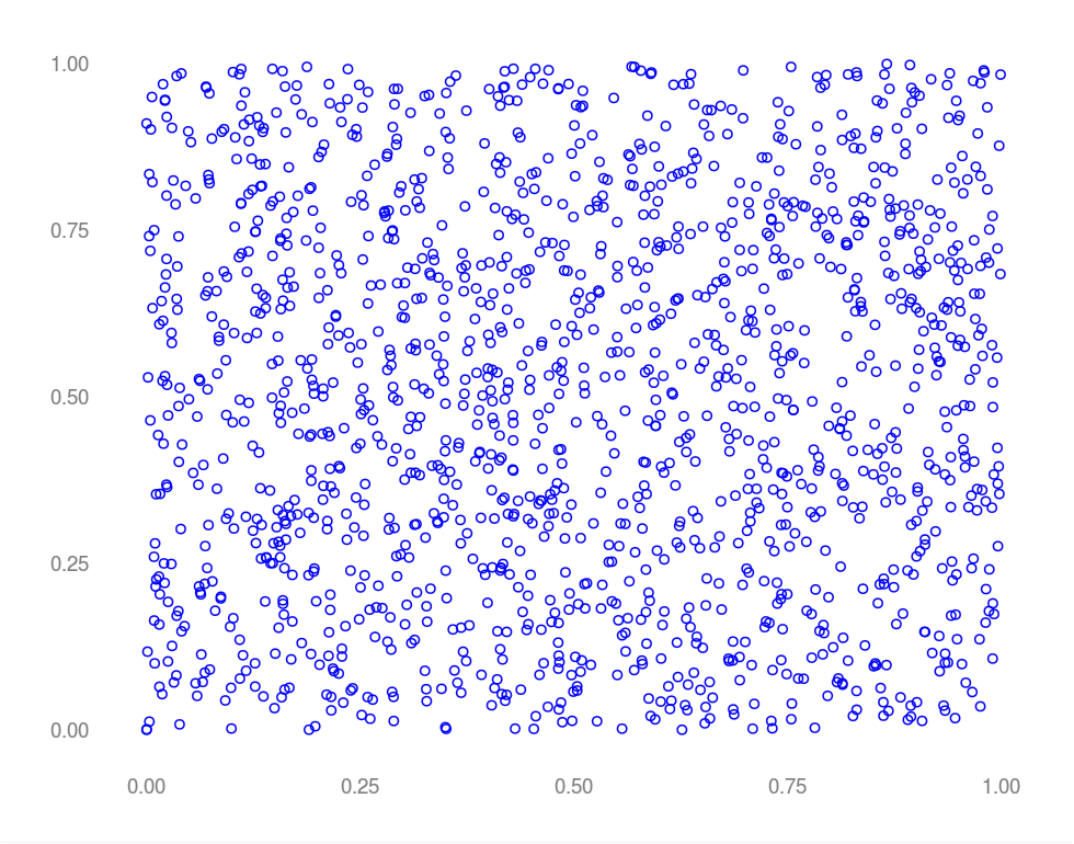
In the image above, successive outputs of RANDU were chosen as (x, y) coordinates. Random, right? What happens if we instead choose successive outputs as (x, y, z) coordinates?
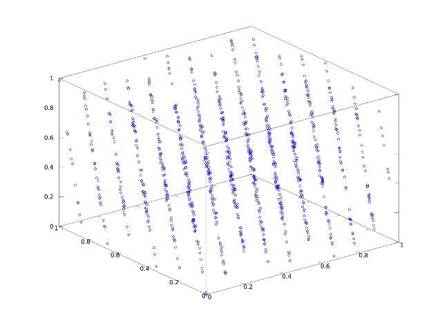
Whoops – clearly not random. Values generated by RANDU fall into 15 two dimensional planes in a three dimensional space – bad news for Monte Carlo. Imagine a simulation generating a random mesh by choosing pseudo random x, y, and z coordinate in succession. RANDU won't even come close to equally representing all possible coordinates in 3 space. Hindsight being 20/20 the issue with RANDU was purely structural. A simple recurrence relationship exists in which the previous two values returned by the algorithm uniquely determine the next. As every value produced is a linear combination of the last two, numbers produced by RANDU "live" in a structured, three dimensional space. One notes that most PRNGs have this characteristic – just in much higher dimensions where the effects aren't as obvious or damaging to simulations of physical processes.
Myopic Views
While randomness is a fascinating topic in its own right the profound realization comes from the image above. Viewed in one or two dimensions the flaw in RANDU isn't obvious; structure only appears under the appropriate transformation to a higher dimensional space. System identification addresses the problem of estimating a state space model (which is itself an n dimensional space where n is the number of states) from noisy, transformed lower dimensional observations. So to what extent can seemingly chaotic data be viewed as a projection down from an orderly high dimensional space? Stay tuned for more on teasing high dimensional structure out of low dimensional data.
Traders love discussing seasonality, and September declines in US equity markets are a favorite topic. Historically September has underperformed every other month of the year, offering a mean return of -.56% on the S&P 500 index from 1950 to 2012; 54% of Septembers were bearish over the same period – more than any other month. Empirically, September deserves its moniker: "The Cruelest Month."
As a trading strategy 54% isn't a substantial win rate, and small N given that it only trades once a year. However, both as a portfolio overlay and as a trading position it's worth considering whether bearishness in September is a statistically significant anomaly or random noise.
Issues With Testing for Seasonality
There are plenty of tests for seasonality in time series data. Many rely on some form of autocorrelation to detect seasonal components in the underlying series. These methods are usually parametric and subject to lots of assumptions – not robust, especially for a non-stationary, noisy time series like the market.
Furthermore, sorting monthly returns by performance and declaring one month "the most bearish" introduces a data snoop bias. We're implicitly performing multiple hypothesis tests by doing so, and as such we need to correct for the problem of multiple comparisons. This gets even more interesting if we consider a spreading strategy between two months, which introduces a multiple comparison bias closely related to the Birthday Paradox.
Bootstrap to the Rescue
The non-parametric bootstrap is a general purpose tool for estimating the sampling distribution of a statistic from the data itself. The technique is a powerful, computationally intensive tool that's easily applied for any sample statistic, works well on small samples, and makes few assumptions about the underlying data. However, one assumption that it does make is a biggie: the data must be independent, identically distributed (iid). That's a deal breaker, unless you buy into the efficient market hypothesis, in which case this post is already pretty irrelevant to you. Bootstrapping dependent data is an active area of research and there's no universal solution to the problem. However, there's research showing that the bootstrap is still robust when these assumptions are violated.
To address the question of seasonality we need a reasonable way to pose the hypothesis that we're testing - one that minimizes issues arising from path dependence. One approach is to consider the distribution of labeled and unlabeled monthly returns. This flavor of bootstrap is also known as a permutation test. The premise is simple. Data is labeled as "control" and "experimental." Under the null hypothesis that there's no difference between two groups a distribution is bootstapped over unlabeled data. A sample mean is calculated for the experimental data, and a p-value is computed by finding the percentage of bootstrap replicates more extreme than the sample mean. September returns form the experimental group, and all other months comprise the control.
The Study
The monthly (log) return was calculated using the opening price on the first trading day of the month and the closing price on the last trading day. Adjusted returns on the S&P index were used in lieu of e-minis or SPY in the interest of a longer return series (we're interested in the effect, not the execution, and on the monthly level there won't be much of a difference in mean).
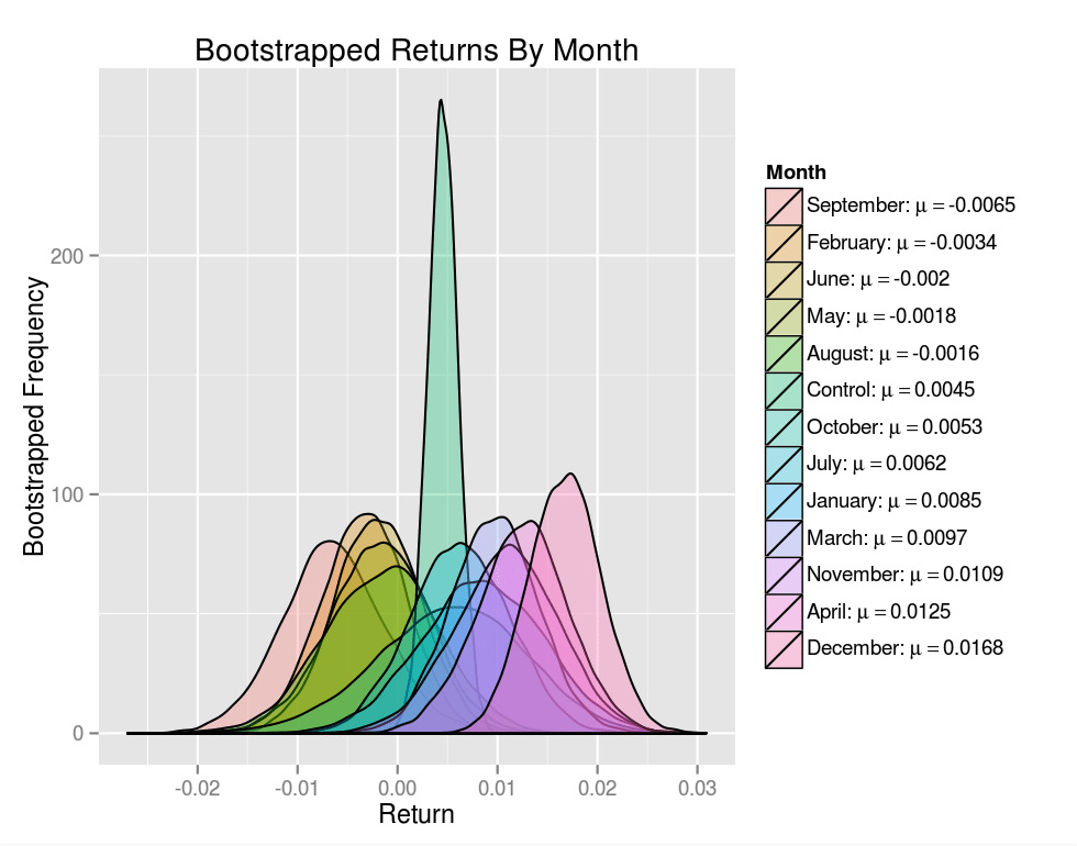
We'll start by taking a look at the bootstrapped distributions of mean monthly returns. The heavy lifting is done by the fantastic XTS, ggplot, and quantmod libraries.
require(quantmod)require(boot)require(ggplot2)require(reshape2)require(plyr)# Download OHLCV data for the S&P 500 cash indexsp.data<-getSymbols("^GSPC",env=.GlobalEnv,from="1950-01-01",to="2012-12-31",src="yahoo",auto.assign=FALSE)# Calculate the adjusted monthly log returnsp.adj.close<-sp.data[,6]sp.monthly.ret<-to.monthly(sp.adj.close,drop.time=TRUE,indexAt='yearmon')sp.monthly.ret<-log(sp.monthly.ret[,4]/sp.monthly.ret[,1])# Split the data into returns, grouped by monthby.month<-split(sp.monthly.ret,.indexmon(sp.monthly.ret))bootstrap.groups<-c(sapply(by.month,function(x){format(index(first(x)),"%B")}),"Control")bootstrap.groups<-factor(bootstrap.groups,levels=bootstrap.groups)# Bootstrap replicate sample countsample.count<-10000# A function to bootstrap the emperical distribution of the sample meanboot.fun<-function(df){samplemean<-function(x,index){return(mean(as.vector(x)[index]))}boot(data=df,statistic=samplemean,R=sample.count)$t}# Calculate a bootstrap distribution for returns data drawn from each month, # and a control group containing unlabeled data from all months.boot.results<-lapply(by.month,boot.fun)boot.results[[length(boot.results)+1]]<-boot.fun(sp.monthly.ret)names(boot.results)<-bootstrap.groupsdf<-melt(as.data.frame(boot.results))names(df)<-c("Month","Return")# Calculate the mean return for each month and the controlmean.returns<-ddply(df,.(Month),summarise,Return=mean(Return))# Sort the bootstrap means for the ggplot legendreturn.order<-with(mean.returns,order(Return))mean.returns<-mean.returns[return.order,]df<-df[with(df,order(match(Month,mean.returns$Month))),]# Reset the levels so that our plot legend displays in the order that we wantdf$Month<-factor(df$Month,levels=levels(mean.returns$Month)[return.order])# Build legend labels (ggplot handles the rendering of special symbols using# bquotes)legend.labels<-mapply(function(month,ret){bquote(paste(.(as.character(month)),": ",mu==.(round(as.numeric(ret),4)),sep=""))},mean.returns$Month,mean.returns$Return)# Draw a density plot of the bootstrap distributions and the controlggplot(df,aes(x=Return,fill=Month))+geom_density(alpha=.3)+scale_fill_discrete(labels=legend.labels)+theme(plot.background=element_rect(fill='#F1F1F1'),legend.background=element_rect(fill='#F1F1F1'))+ylab("Bootstrapped Frequency")+ggtitle("Bootstrapped Returns By Month")
The image above shows a bootstrap distribution for each calendar month, as well as the control. The control distribution is much tighter as there's 12 times more data, which by the Central Limit Theorem should result in a distribution having σcontrol≈√12σ.
Plots of boostrapped distributions offer a nice visual representation of the probability of committing type I and type II errors when hypothesis testing. The tail of the single month return distributions extending towards the mean of the control distribution shows how a Type II error can occur if the alternative hypothesis was indeed true. The converse holds for a Type I error in which the tail of the null hypothesis distribution extends towards the mean of an alternative hypothesis distribution.
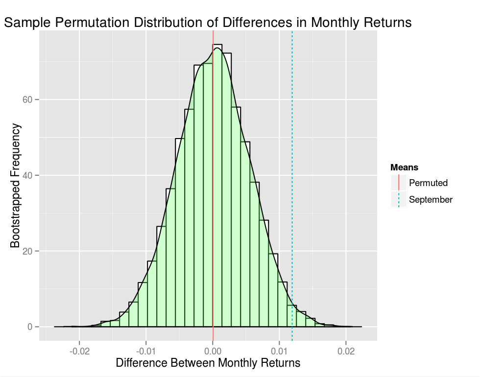
# Split our monthly returns into a September and a "Not September" groupsep.returns<-as.vector(sp.monthly.ret[.indexmon(sp.monthly.ret)==7,])ex.sep.returns<-unlist(split(sp.monthly.ret[.indexmon(sp.monthly.ret)!=7,],f="years"))# Compute the mean difference between the groupmean.diff.sep<-mean(ex.sep.returns)-mean(sep.returns)# Pool the two groups and create sample.count bootstrap replicatespooled<-c(sep.returns,ex.sep.returns)sample.mat<-matrix(data=pooled,nrow=sample.count,ncol=length(pooled),byrow=TRUE)sampled<-t(apply(sample.mat,1,sample))group1<-sampled[,1:length(sep.returns)]group2<-sampled[,(length(sep.returns)+1):length(pooled)]# Compute the mean difference between our two permuted sample groupsmean.diff.sampled<-data.frame(mean.diff=apply(group1,1,mean)-apply(group2,1,mean))# Plot a distribution of mean differences between monthly returnsmean.diff.df<-data.frame(Means=c("Permuted","September"),Value=c(mean(mean.diff.sampled),mean.diff.sep))ggplot(mean.diff.sampled,aes(x=mean.diff))+geom_histogram(aes(y=..density..),colour="black",fill="white")+geom_density(alpha=.3,fill="#66FF66")+geom_vline(data=mean.diff.df,aes(xintercept=Value,linetype=Means,colour=Means),show_guide=TRUE)+theme(plot.background=element_rect(fill='#F1F1F1'),legend.background=element_rect(fill='#F1F1F1'))+xlab("Difference Between Monthly Returns")+ylab("Bootstrapped Frequency")+ggtitle("Sample Permutation Distribution of Differences in Monthly Returns")cat(sprintf("p-value: %.4f\n",sum(mean.diff.sampled>mean.diff.sep)/sample.count))
My p-value was p=.0134 (your mileage will vary as this a random sample after all) - pretty statistically significant as a stand alone hypothesis. However, we still have a lurking issue with multiple comparisons. We cherry picked one month out of the calendar year – September – and we need to account for this bias. The Bonferroni correction is one approach, in which case we would need α=12.05=.0042 if we were testing our hypothesis at the α=.05 level. Less formally our p-value is effectively 0.1608 – not super compelling.
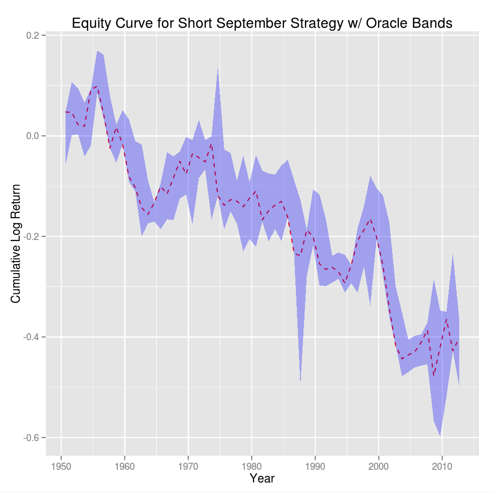
Putting the statistics aside had you traded this strategy from 1950 to present your equity curve (in log returns) would look like:
sep.return<-sp.monthly.ret[.indexmon(sp.monthly.ret)==7,]sep.return.vals<-as.vector(sep.return)sep.return.cum<-cumsum(sep.return.vals)sep.return.cum.delta<-sep.return.cum-sep.return.valshigh.band<-sep.return.cum.delta+sapply(split(sp.monthly.ret,f="years"),max)low.band<-sep.return.cum.delta+sapply(split(sp.monthly.ret,f="years"),min)return.bands<-data.frame(Date=as.Date(index(sep.return)),Return=sep.return.cum,High=high.band,Low=low.band)ggplot(return.bands,aes(x=Date,y=Return,ymin=Low,ymax=High))+geom_line(color='red',linetype='dashed')+geom_ribbon(fill='blue',alpha=.3)+theme(plot.background=element_rect(fill='#F1F1F1'),legend.background=element_rect(fill='#F1F1F1'))+xlab("Year")+ylab("Cumulative Log Return")+ggtitle("Equity Curve for Short September Strategy w/ Oracle Bands")
The high and low bands show the return for the most bullish and bearish month in each year. It's easy to see that September tends to hug the bottom band but it looks pretty dodgy as a trade – statistical significance does not a good trading strategy make.
Closing Thoughts
Bootstrapping September returns in aggregate makes the assumption that year-over-year, September returns are independent, identically distributed. Given that the bearishness of September is common lore, it's reasonable to hypothesize that at this point the effect is a self-fulfilling prophecy in which traders take into account how the previous few Septembers went, or the effect in general. If traders fear that September is bearish and tighten stops or liquidate intra-month, an anomaly born out random variance might gain traction. Whatever the cause, the data indicates that September is indeed anomalous. As for a stand-alone trading strategy…not so much.
A few years ago my office started an NFL survivor pool as a fun way to kick off the 2011 season. The premise is simple: every week you pick a team to win their game. You can't pick a team on a bye week, and once you pick a team you can't pick the same team again for the rest of the season. If the team you pick loses their match then you're out, and the last man standing takes all. If multiple players make it to the post season then the game restarts for the survivors, and if multiple players survive the Super Bowl, the prize pool is chopped.
The strategies used varied from the highly quant to the decidedly not quant – "I hate the Patriots" – approach. There's a lot of richness in this problem, and it's easy to go down the rabbit hole with opponent modeling and views on what you're trying to optimize. However, taking the simplified approach that you're only trying to maximize your probability of surviving to the end, or to a specific game, there's a slick way to optimize your lineup. Since we're getting ready to kick off the 2013 season…it's time to get those bets in.
The Problem
Let C be an n×m matrix in which each row represents a team, each column represents a game week, and the probability of team i winning their game on week j is xij. The probability of surviving until game l is given by:
Φ=k=1∏lCf(k),k
Where f(k) is a mapping from game weeks to teams. We want to maximize Φ over the set of all possible mappings f that satisfy our constraints. To simplify the problem we require that n=m (we can always do this by adding "dummy" game weeks or teams to the cost matrix) and by taking the log of both sides. Now we're working with sums instead of products and we can view f as a bijection f:T↦G where T is the set of all teams and G is the set of all games. The cost function becomes C:T×G↦R and our optimization problem becomes:
argmaxfΦ(C,f)=i∑Ci,f(i)
where f∈Sn, the set of all permutations on n objects. This is the classic assignment problem in which we wish to minimize the cost of assigning agents to tasks. It's easy to express this as a linear programming problem, and doing so yields:
xij={10if team i is assigned to week jotherwiseargminxi∑nj∑ncijxij
Where cij is the cost of assigning team i to week j. This smells like the Travelling Salesman Problem (TSP) which doesn't bode well for us, and since we're considering all f∈Sn we know that there are n! candidate solutions.
Now comes the cool part. Solutions to TSP require that the salesman travels via a single connected tour through the cities whereas the formulation above allows for disjoint subtours. Enforcing the "single tour constraint" on the linear programming formulation of TSP requires a number of constraints that's exponential in the problem size, ergo the NP-Hard part. We don't have such a constraint, and the problem is solved in O(n3) time using the Hungarian Method.
Once you have your solution your expected survival time is:
I based my win probability matrix on Vegas moneylines. This works under the premise that win probabilities can be implied directly from the Vegas book - not a fantastic assumption, especially for the NFL, which will be the topic of another post. I added a few parameter bumps based on my own views to keep things interesting. The code, using R and the clue library, was dead simple:
The code given assumes that you have a matrix called win.prob with row and column names, that each row represents a team, that each column represents a game, and that there are more teams than games (you'll need to get rid of the transpose otherwise - clue can handle rectangular problems as long as n≤m).
Improvements
In reality, maximizing expected survival time is probably the way to go. The "probability of surviving until the end" approach completely overlooks the fact that you just need to outlast your other opponents - not close out the season in style.
However, the probability approach has a cool solution, and maximizing expected survival time is a constrained non-linear (albeit polynomial) integer programing problem. Yikes. In practice that's what I did and I might write about it later but the result was much ado about nothing. After lots of work, the schedules were very similar and only resulted in a marginal increase in expected survival time. Even the greedy solution gets you most of the way there; for my matrix of probabilities the difference between the greedy solution and the optimal one was relatively small.
It's interesting to think about one scenario in which you do want to maximize the probability of surviving to game n as we did above in lieu of expected survival time. Weekly picks are public, and if inclined you could feed said historical picks from other players into your optimizer and calculate your opponent's expected survival time. Finding the max expected survival time over all of your opponents gives you the number of games that you need to last.
Conclusion
Buying into the pool definitely wasn't a high Sharpe bet. A huge chunk of the office was wiped out by a game two upset, and I got knocked out within a game of my expected survival time. Almost everyone was out by mid season. Good times all around.